The five colors as the live site and its brand guidelines use them, plum, ember and paper doing most of the work.
Case 4Free welfare help and mentoring
Warm Centre
Making free help feel warm, plain and safe to ask for.
In plain words
- What they do
- A free drop-in center in Brisbane: help with benefits, rent, bills and food, and a mentor who stays after the urgent things are sorted.
-
What we made
The website and every word on it, and brand guidelines for it: the colors, the type, the degree sign and the icons.
-
What they own
The site’s files, the publishing setup, and the brand guidelines as a twelve-page book.
What we decided, and why
The site is written for a person who may be reading on an old phone, in a hurry, and asking for help for the first time, so every sentence had to be one they could act on.
-
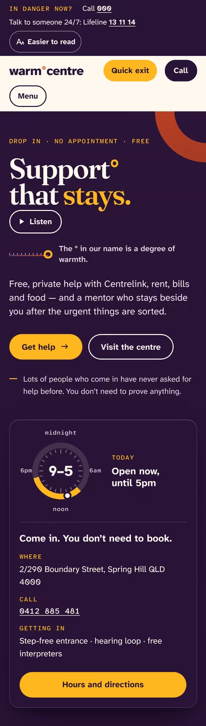
Every page opens on a safety bar and a quick exit.
A person reading about family safety may be watched. The bar names 000 and Lifeline on every page, and Quick exit, or the Escape key pressed twice, opens a weather page and takes this one out of the history.
-
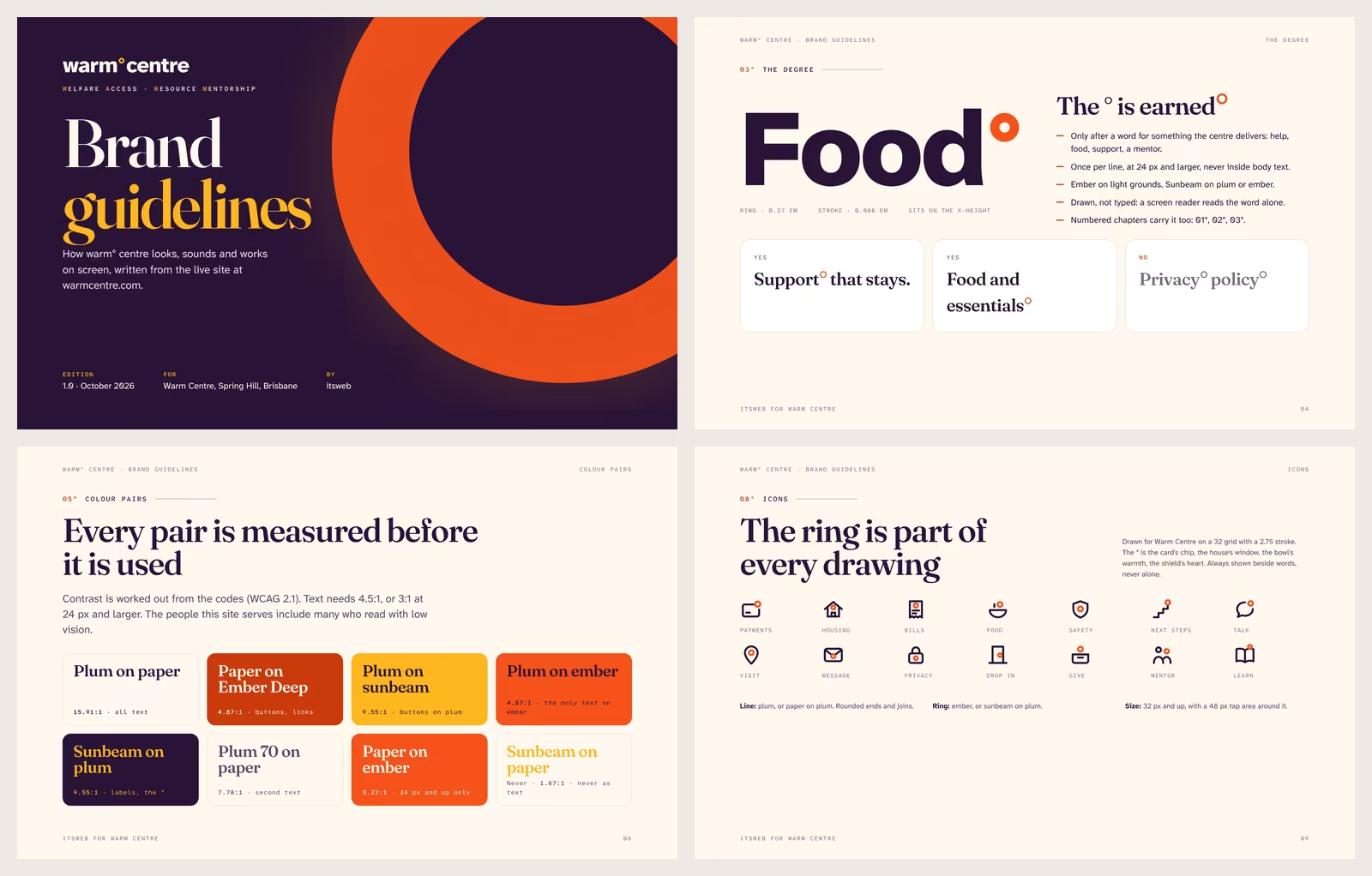
The degree sign in the name became the whole system.
The ° in the name is a degree of warmth. It became the ring of the opening hours dial, the scale that shows support growing, the marks that stand in for bullet points, and the ring inside each of the fourteen icons drawn for the center. The brand guidelines set its rules: only after something the center gives, and once per line.
-
Headlines in a warm serif, and everything people read in a typeface made for low vision.
The reading type was drawn by the Braille Institute so that letters which look alike cannot be mistaken for each other, and it is never set smaller than the phone’s own default. The serif carries only the big lines, always upright, never italic.
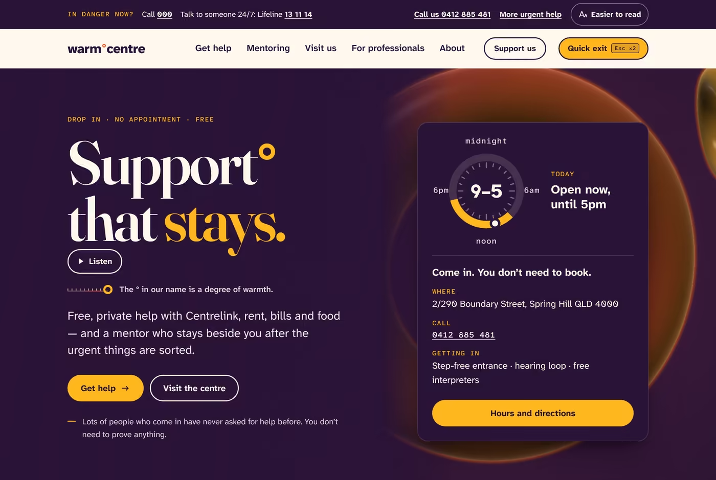
The logo, the colors and the site

Technical notes for your web person
What changed, measured
- A quick way out on every page, by one button or the Escape key pressed twice.
- Every color pair that sets words was measured before it was used.
- No tracking, no cookies and no outside fonts.
Every pair of colors that sets words was measured before it was used, and the main text clears the minimum for easy reading more than three times over.
Plum on paper 15.91:1; buttons and links, paper on Ember Deep, 4.87:1, against a minimum of 4.5:1 for text.
A quick way out on every page: one button, or the Escape key pressed twice.
On all 23 built pages; the page is replaced in the history, so Back does not return to it.
No tracking, no cookies and no outside fonts.
0 of each across the built pages; three typefaces served from the site itself, 119,072 bytes together.
Every figure, and what it measures
15.91:1
Plum on paper, the main text color on the main ground.
4.87:1
Paper on Ember Deep, every button and link color on paper.
23 of 23
Built pages carrying the quick exit.
0
Outside scripts, analytics and cookies on the built pages.
119,072 bytes
The three typefaces, served from the site itself.
What we found when we started
- The copy we were briefed with read at university level and used words such as “premium” and “Tier-1 reference node”, for people who may not be able to pay rent this week.
- It had no safety layer: no emergency numbers and no quick way out, which any Australian service close to family violence needs.
The decisions, as a web person reads them
The site is written for a person who may be reading on an old phone, in a hurry, and asking for help for the first time, so every sentence had to be one they could act on.
Every page opens on a safety bar and a quick exit.
A person reading about family safety may be watched. The bar names 000 and Lifeline on every page, and Quick exit, or the Escape key pressed twice, opens a weather page and takes this one out of the history.
The degree sign in the name became the whole system.
The ° in the name is a degree of warmth. It became the ring of the opening hours dial, the scale that shows support growing, the marks that stand in for bullet points, and the ring inside each of the fourteen icons drawn for the center. The brand guidelines set its rules: only after something the center gives, and once per line.
Headlines in a warm serif, and everything people read in a typeface made for low vision.
The reading type was drawn by the Braille Institute so that letters which look alike cannot be mistaken for each other, and it is never set smaller than the phone’s own default. The serif carries only the big lines, always upright, never italic.
The files, as a web person names them
- The site’s files and the publishing setup
- Brand guidelines as a twelve-page book: the colors with their contrast, the type, the degree sign, the icons and the voice
Yours, next.
Tell us what you have. We reply within two business days.
Next start: Monday, November 30
Or write to hello@bewsti.com.